A thumbnail is not a graphic design project. It is a one-second sales pitch, rendered as an image, competing for attention against dozens of other one-second pitches on the same screen.
Once you accept that, thumbnail design gets simpler. You stop asking "does this look good?" and start asking "does this win a glance?"
If you haven't read why your thumbnail decides clicks before your title does, start there. This post is the follow-up: once you know why the thumbnail matters, here's the framework for actually designing one.
1. Pick the focal point before you pick anything else
The single biggest reason thumbnails fail is that the eye can't find a place to land.
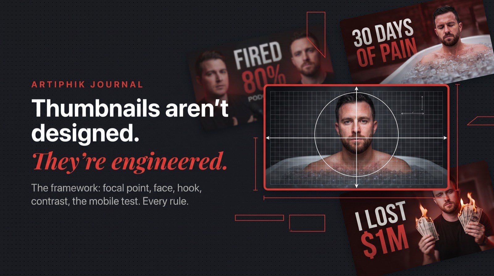
A strong thumbnail has one focal point. Not a hero subject competing with a text block competing with a background prop. One thing the eye hits first, in the first 300 milliseconds.
Before you design anything, answer this: if a stranger squints at your thumbnail for a half-second, what's the one thing they should see?
Common focal points that work:
- A face locked in an expression that the video is about to explain
- A single bold number ("$1" or "100 Days")
- A product placed at the visual center with no competition
- A contrast pairing (before/after, good/bad, old/new)
If your focal point is "a vibe" or "the whole scene," you don't have one yet.
2. Build around the face (if there is one)
Human brains are wired to lock onto faces before anything else. This isn't aesthetic advice. It's how the visual cortex works.
A face in a thumbnail should do three things:
- Be readable at phone size. If the face is smaller than a fingertip on a 6-inch phone screen, you've wasted it. Crop tighter.
- Carry a clear emotion. Surprise, disgust, shock, delight, confusion. Neutral expressions are invisible. If you can't name the emotion in one word, it's not strong enough.
- Point the eyes somewhere intentional. Either directly at the camera (to make a promise) or locked onto the product or text (to direct the viewer's attention there too).
If the face is looking at nothing, the viewer does the same.
The exception: if your video is faceless (tutorial, B-roll, product-focused), don't force a face in. A strong product shot beats a weak stock-face every time.
3. Treat the text like a marketing hook, not a title
Thumbnail text has one job: create curiosity the title can't close.
If your title is "I reviewed the cheapest mic on Amazon" and your thumbnail text is "Cheapest Mic Review," you've wasted the text slot. The thumbnail text should be saying something like "IT SOUNDED INSANE" or "$4 MIC." That's the hook that makes the viewer want the title to confirm it.
Rules that compound:
- Five words or fewer, total, across the whole thumbnail. Ideally 2–4 in a hero phrase. More than five and the thumbnail becomes unreadable at phone size.
- One size hierarchy. One phrase is the hero (biggest, boldest). Everything else is smaller supporting text. Two equal-sized text blocks cancel each other out.
- Say it out loud. If the phrase doesn't sound like something a real human would say with excitement, rewrite it. "BROKE TO RICH" works. "The Ultimate Guide To Wealth Creation" does not.
- Never repeat the title. The title is visible right next to the thumbnail. Use the text slot to add, not echo.
A thumbnail without text can outperform one with bad text. Text that doesn't hook is worse than no text. (The title on the video does a different job: it closes the click the thumbnail opened. We broke down the seven formulas for that in YouTube title formulas that actually work.)
4. Earn contrast, don't fake it
Contrast is what makes a thumbnail "pop" in a feed. But contrast is not about saturation or neon colors. It's about separation.
Three kinds of contrast worth building deliberately:
- Subject vs background. If your subject blends into the scene behind them, they disappear. Use lighting, color, or blur to isolate them.
- Text vs surface. Text placed on a busy background dies. Either put the text on a clean patch of the image, or anchor it with a subtle shape behind it.
- Color temperature. Warm subject against a cool background (or vice versa) creates instant depth. This is why so many strong thumbnails have orange/teal, red/blue, or yellow/black palettes.
When in doubt, desaturate the background and let the subject carry the color. The eye will follow.
5. The mobile test is the only test that matters
Somewhere between 70% and 80% of YouTube watch time happens on phones. That means your thumbnail will spend most of its life about the size of a postage stamp.
Before you export, do this:
- Save the full-size thumbnail.
- Shrink it to 320 pixels wide.
- Look at it from across the room.
If you can still tell what the video is about, you've done the job. If the face is a blur, the text is illegible, or the focal point vanished, the thumbnail is dead on arrival, no matter how clean it looked at full size.
Most thumbnails fail this test. Most creators never run it.
6. Stop designing, start testing
Here's the part most creators skip: you don't know which thumbnail will win until you test.
The shift that changes everything is treating each thumbnail like an ad, not a deliverable. Ads get variants. Ads get reviewed. Ads get killed when they don't perform.
Two habits that compound over a year of uploads:
Generate variants before you commit. The first thumbnail idea is almost never the best one. Spinning up three or four options from the same brief, with different focal points, different text angles, different compositions, takes less time than most people spend tweaking the first one. You keep the strongest, graveyard the rest.
Critique what's already live. The thumbnails on your back catalog are free data. A thumbnail that underperformed a year ago can tell you exactly what to avoid this week: weak focal point, overloaded text, low mobile contrast, competing colors. Most creators never go back and look. The ones who do learn faster than everyone else.
This is exactly where Artiphik fits. Thumbnail Studio lets you generate a handful of strong variants from a single brief in a minute. Thumbnail Critique reviews your existing thumbnails and tells you precisely what's hurting them. You ship fewer bad thumbnails, and you stop making the same mistake twice.
The summary
Good thumbnails aren't designed. They're engineered:
- One focal point, decided before anything else
- A face with a readable expression, or no face at all
- Text that hooks, not text that summarizes
- Contrast built through separation, not saturation
- Mobile-tested before it ever goes live
- Variants generated, the best one picked, the losers learned from
The creators who compound on YouTube treat every thumbnail like a bet. The ones who treat it like a design task plateau.
Before you publish, run your design through the free YouTube thumbnail tester. It drops your thumbnail into a realistic home feed, search results, and the 168px sidebar next to real competitors, with a squint test built in.
Want to see what your next thumbnail looks like before you commit? Try Thumbnail Studio free. Generate a handful of variants in under a minute, pick the strongest, ship the winner. Two free thumbnails, no card required.