MrBeast is the most studied YouTuber alive. His thumbnails alone are reverse-engineered in 10,000 videos on YouTube itself. So why do most creators who copy him still plateau at 3 percent CTR?
Because they copy the look, not the system.
I pulled 50 of MrBeast's top-performing thumbnails from 2023 to 2026 and sat with them. Five patterns show up in almost every single one. The patterns are not secrets. The discipline of applying all five on every upload is what separates his thumbnails from the copy-paste versions flooding the platform.
This post is the breakdown. What you do with it is up to you.
The frame: MrBeast thumbnails are engineered for mobile-first scroll
Before the patterns, the constraint that explains them.
More than 70 percent of YouTube views happen on phones. At that scale, the home-feed thumbnail is roughly 200 by 113 pixels. Tiny. A thumbnail that looks incredible on a 16-inch monitor can completely disappear inside an iPhone feed.
Every pattern below is a solution to that constraint. The team is not designing thumbnails for people sitting at their desk. They are designing for someone with a thumb, 0.4 seconds of attention, and 30 other thumbnails on the same screen fighting for it.
If you keep that single frame in mind, the rest of the rules stop feeling arbitrary.
Pattern 1. One focal subject, nothing else competing
Look at any MrBeast thumbnail. There is exactly one thing your eye lands on.
A pile of money. A giant object. A face. A car on fire. The viewer's brain does not have to parse a busy image, because the image has been stripped down to a single focal point.
Most amateur thumbnails fail this rule. They cram a face, three objects, a logo, and a text block into the same frame. The result is a soup that reads as noise at 200 pixels wide.
How to apply it:
- Pick one subject. Only one. If you cannot point to a single thing and say "this is what the video is about," simplify.
- Blur, darken, or crop out everything else. The subject has to be the brightest, most colorful, most in-focus element.
- If you are using a face, the face is the subject. Nothing else can compete with it. Props go in the background, not the foreground.
One subject does more than clean up the image. It tells the viewer in half a second what the video is about. That speed is the whole game.
Pattern 2. Exaggerated, single-emotion face
Most MrBeast thumbnails feature a face. Almost every face is doing exactly one thing.
Shock. Triumph. Disbelief. Fear. Pure joy. One emotion, dialed to 11.
This is not because MrBeast has weird friends. It is a deliberate choice. A neutral face reads as nothing at thumbnail scale. A slightly surprised face reads as nothing. A face pulled into a cartoonish expression reads as information even at 200 pixels wide.
The rule the MrBeast team seems to use: if you can guess the emotion from 20 feet away with the screen brightness on 40 percent, it works.
How to apply it:
- Shoot multiple expression takes for every video, even if they feel over the top. You can always dial back later. You can never recover footage that is too subtle.
- Tight crop. The face should be at least 40 percent of the thumbnail height. A small face in a wide frame reads as nothing.
- Pick one emotion and commit. "Surprised and confused" is not a thumbnail. "Losing my mind" is.
The counterintuitive part: you can run this pattern without ever using your own face. A tight crop of any subject reacting (a dog, a friend, even an object with anthropomorphic framing) works the same way. The point is isolated, legible emotion, not face specifically.
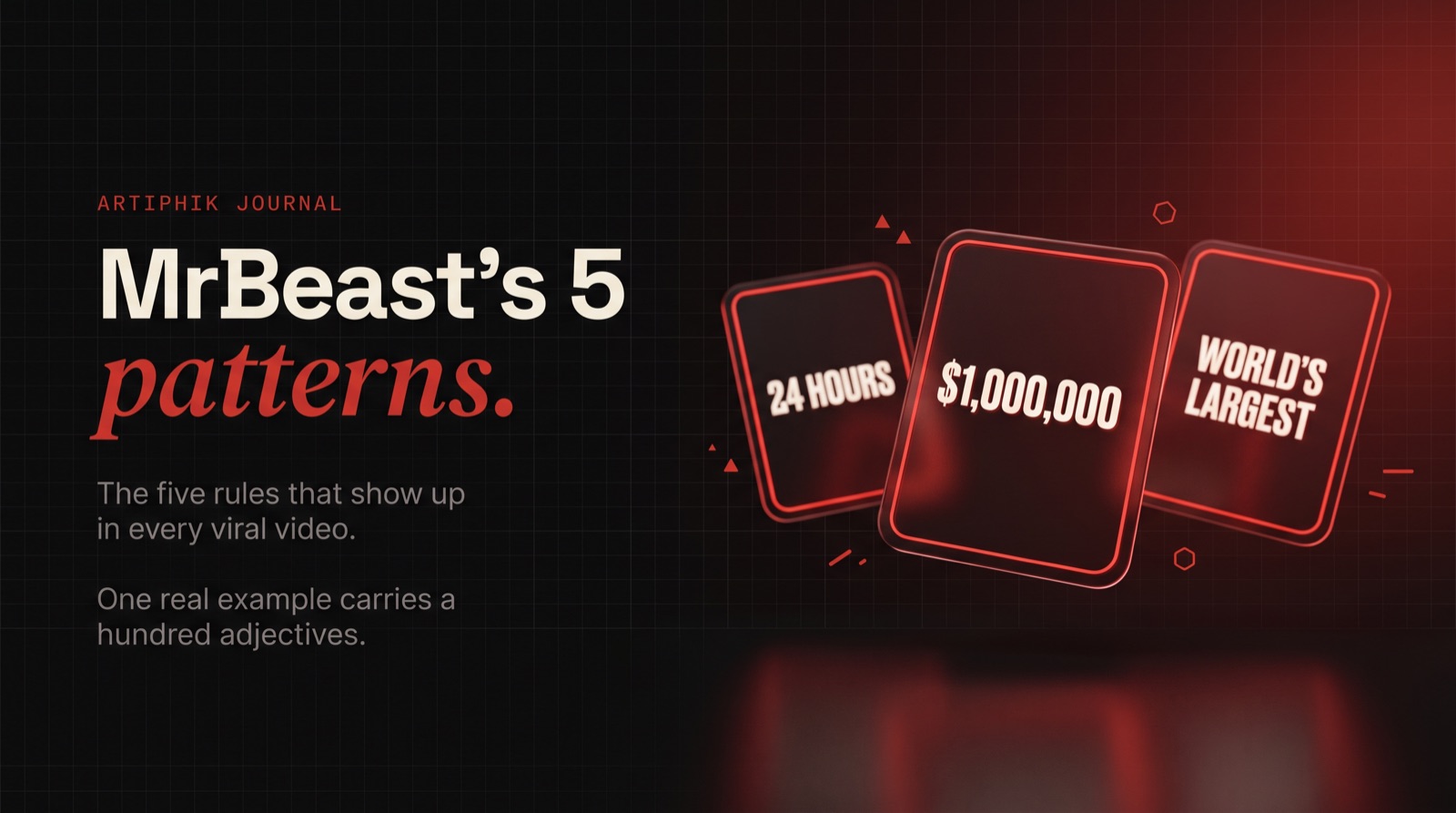
Pattern 3. A number or stake visible in the frame
Walk through MrBeast's top 20 thumbnails and count how many have a number or stake visible. Almost every one.
$1,000,000. 100 Days. Last to Leave Wins $500,000. World's Largest. 24 Hours.
Numbers do three things at once:
- They tell the viewer exactly what the video promises.
- They create contrast against the image (a bright number on a dark subject pops).
- They give the brain a concrete thing to remember, which is why these thumbnails stick in your head even weeks later.
The stake does not have to be literal money. It can be time (24 hours), scale (world's largest), opposition (vs 100 kids), or consequence (or I lose everything). But it has to be concrete. Vague stakes like "this changes everything" do not work at thumbnail scale because the viewer cannot visualize them in 0.4 seconds.
How to apply it:
- Figure out the single concrete thing the video promises. Put it in the thumbnail as a number or short phrase.
- Make the number huge. 80 pixels tall minimum on the final 1280 by 720 export.
- Pair it with a contrasting color to the background. Bright yellow on dark blue, bright red on black, white on saturated red.
Creators often skip this pattern because their video "does not have a number." Almost every video does. You just have to find it. A tutorial has a time promise (in 10 minutes). A vlog has a quantity (5 things I learned). A review has a comparison (vs the alternative). The pattern exists. Surface it.
Pattern 4. Saturation and contrast tuned for small screens
Open three MrBeast thumbnails side by side. Notice anything about the color?
Red. Yellow. Bright blue. Deep black. Almost never muted tones.
This is because saturated colors survive the 200 by 113 pixel display. Muted tones do not. A thumbnail that looks "tastefully designed" on a Figma canvas often disappears in a YouTube feed because the saturation is not high enough to compete with 10 louder thumbnails around it.
MrBeast's team treats color like a volume knob, not an aesthetic. The thumbnails look loud because they need to be loud to be seen.
How to apply it:
- Push saturation. If your thumbnail feels slightly cartoonish on a desktop monitor, it is probably correctly calibrated for mobile. If it feels tasteful and muted, it is probably invisible on a phone.
- Use one or two hero colors. A bright subject on a complementary-color background (red on cyan, yellow on purple) creates the maximum pop.
- Check on a phone before publishing. Every time. Thumbnails designed at 100 percent zoom on a 27-inch monitor lie to you. The phone check is non-negotiable.
This pattern is also where taste matters least. A "beautiful" thumbnail can absolutely lose to an "ugly" thumbnail on CTR. The feed does not reward craft, it rewards legibility.
Pattern 5. Text is minimal, specific, and readable
Last pattern, and the one creators break most often.
MrBeast thumbnails that use text almost never use more than 2 to 4 words. And when they do use words, the words are concrete.
$10,000 / CURSED / WORLD'S FASTEST / 24 HOURS / DON'T BLINK.
Never a sentence. Never a tagline. Never three ideas in the same box. One phrase, usually a number or a stake, sized so it is legible at thumbnail scale.
The trap most creators fall into: they try to explain the video in the thumbnail text. That does not work because at 200 pixels wide, a sentence is unreadable and the viewer has already scrolled by the time they would have read it. The text is not a caption. It is a hook.
How to apply it:
- Write 5 to 10 potential text options for every thumbnail. Pick the shortest one that still carries the hook. Shorter almost always wins.
- Bold sans-serif font, heavy weight. Impact, Oswald, Montserrat Black. Thin fonts disappear at scale.
- Stroke or drop-shadow the text so it survives any background. Unstroked text on a busy image is unreadable on mobile.
- Never use full sentences. If it has a verb, a comma, and a conjunction, it is too long.
The harsh rule: if a viewer cannot read the text on your thumbnail from across a room on a dimmed phone screen, the text is decoration, not a hook.
The system, not the style
If you read all five patterns and thought "I have seen this before," that is the point.
Nobody became a top 1 percent YouTuber by inventing a new thumbnail convention. They became one by running the same five patterns on every upload, for years, with discipline. The patterns are boring. The discipline is rare.
The thumbnails that flood YouTube chasing MrBeast's style usually copy one pattern, maybe two. A shocked face. A bright color. They miss the stake, the focal simplicity, the text discipline. Then they conclude the style does not work for their niche. It is not the style, it is the incomplete system.
If you run all five patterns on your next upload, and the one after, and the one after that, your CTR will tell you whether packaging is your ceiling or your floor. Most creators never run the full system long enough to find out.
The shortcut worth knowing
The five patterns take time. Shoot the expressions, design the focal subject, add the number, tune the saturation, write the text. A single thumbnail done properly takes 1 to 3 hours of dedicated work.
That is the problem we are building Artiphik to solve. We trained the thumbnail generator on what is actually going viral per niche, so the five patterns show up in the output by default. You get focal simplicity, expression-first composition, saturation tuned for mobile, and minimal readable text in the first generation, not after three hours of tweaking.
Try the free tier if you want to see the patterns applied to your niche without building them from scratch. Two full thumbnails on the free plan, no card, nothing to cancel.
MrBeast is not a mystery. The thumbnails are the map. The discipline is the territory.
Related: why your YouTube thumbnail matters more than your title and how to design YouTube thumbnails that get clicks.