
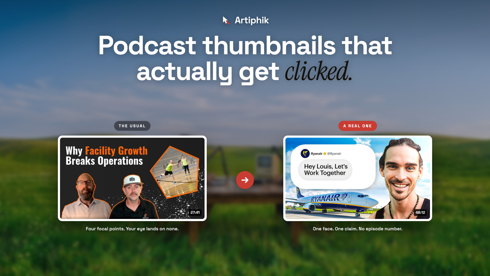
Open any company podcast on YouTube and scroll the uploads. You will see the same image forty times.
Two people at a desk. Headphones on. Microphones between them. Slightly different arm positions. A caption underneath that reads "Episode 46."
Or, just as often, this:
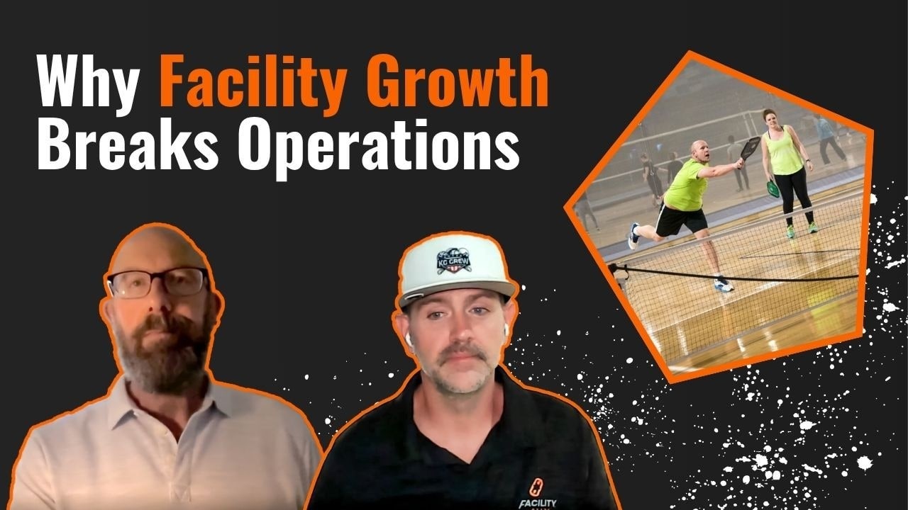
That one is real, from a company podcast published this week. It is not lazy. Somebody spent time on it. Cutouts were masked, a frame was angled, speckle effects were added, a headline was written.
And that is the problem. Count the places your eye is being sent: two faces bottom left, a photograph top right, a five-word headline across the top, plus scattered white flecks in between. Four focal points is the same as none. The eye arrives, finds no single thing to land on, and moves to the next video in the feed.
Look at the faces too. Both are webcam frames, flatly lit, both wearing the same mild expression. At display size neither reads as anything. And the headline, "Why Facility Growth Breaks Operations," is five words of abstract nouns. It describes a topic. It does not make a promise, and nothing in it belongs to a person.
Podcast thumbnails are the worst category on YouTube, and the reason is structural rather than lazy. A podcast is two people talking for an hour. There is no explosion, no reveal, no visual moment. Whoever makes the thumbnail opens the footage looking for a frame and finds nothing but faces mid-sentence, so they pick one and move on.
Here is what to do instead.
The competition is not other podcasts
Your episode does not appear in a list of podcasts. It appears in a feed, next to whatever else YouTube decided to show that person, made by people who do this full time.
You are one rectangle among twenty. The viewer is moving. The decision happens in well under a second and it happens before anyone knows what your episode is about.
This is the part that makes podcast thumbnails hard to get right from the inside. You have heard the conversation. You know it was good. The person scrolling has none of that. All they have is a small picture and a line of text, and if those do not stop them, the conversation may as well not exist. If your channel is publishing consistently and getting nowhere, that is usually the whole explanation.
Design at 1280. Judge at 200.
A YouTube thumbnail is uploaded at 1280 by 720. It is almost never seen at that size.
On a phone home feed it renders around 200 pixels wide. In the suggested sidebar beside a playing video it is smaller. On a laptop home page it sits somewhere in between.
So the only test that matters is the small one. Almost every bad podcast thumbnail looks fine at full size on a desktop monitor, which is exactly where it was designed and approved, and falls apart at the size a human actually meets it.
Two people at a desk becomes two beige smudges. Text set at a comfortable reading size becomes a grey line. The logo becomes a dot.
Before you publish anything, shrink it. Put it next to the videos it will genuinely appear beside and look at the whole row at once. Our free YouTube thumbnail tester does exactly this: it drops your image into a real home feed, search results and the sidebar, at the real sizes, with a squint test built in. It takes about ten seconds and it will change most of your decisions.
One face, filling the frame
The single highest-return change available to most podcast channels is to stop showing the room.
A wide shot of two people at a table gives each face maybe 60 pixels at display size. Nothing is legible. Emotion, which is the thing that actually makes a person stop scrolling, is invisible.
Crop in. One face, large, with a readable expression. Faces with clear emotion have been repeatedly shown to lift click-through rate by roughly 20 to 30 percent, and the reason is not mysterious: humans are built to notice faces and to read them fast, but only when they are big enough to read.
If you must show two people, make one dominant and the other secondary. Equal-sized heads facing each other is a photograph of a conversation. It is not an invitation to one.
Here is an episode from a B2B channel we took from under 1,000 subscribers to more than 180,000:

One face, filling half the frame, looking straight down the lens. A claim you can read in a second, borrowed from a brand the audience already recognises. No episode number anywhere. You know what the conversation is about before you read a single word of the title.
Use the guest, not the host
On most company podcasts the host appears in all 200 thumbnails.
Which means the host communicates nothing. Their face is a constant, and constants carry no information. Someone scrolling cannot use it to tell episode 46 from episode 12.
The guest is the only thing that changes each week. That makes them the most valuable object in the frame. If the guest has any recognition in your industry, their face is also a reason to click that no amount of design can manufacture.
Show the host if the show is built on their name and the audience follows them personally. Even then, put them smaller, in a corner, as a signature rather than a subject.
Text: fewer words, much bigger
Three or four words. Occasionally five. Set larger than feels comfortable.
The mistake is treating the thumbnail as a place to explain. Explanation is what the title is for. The thumbnail's job is to create the itch that makes someone read the title at all.
Which means the two should not say the same thing. If the title is "Why we killed our best-selling product," the thumbnail should not say "Killing our best product." It should say something the title does not, and the two together should make a complete thought that neither one finishes alone.
And it has to survive the shrink. Test the words at 200 pixels wide, not on your monitor at full size. A useful discipline: if you cannot read it from across the room with your eyes half closed, it is too small or too crowded.
Consistency is not sameness
This is where most company podcasts go wrong, and it is the least obvious mistake on the list.
Everyone is told to be consistent so the show is recognisable. That advice is right and it gets applied to the wrong layer.
Keep the system constant. Same typeface. Same text placement. Same colour treatment. Same corner for the show logo. A returning viewer should recognise your show in half a glance without reading anything.
Change the subject every time. Different guest, different expression, different promise, different crop. A new viewer must be able to tell that episode 46 is not the episode they already skipped.
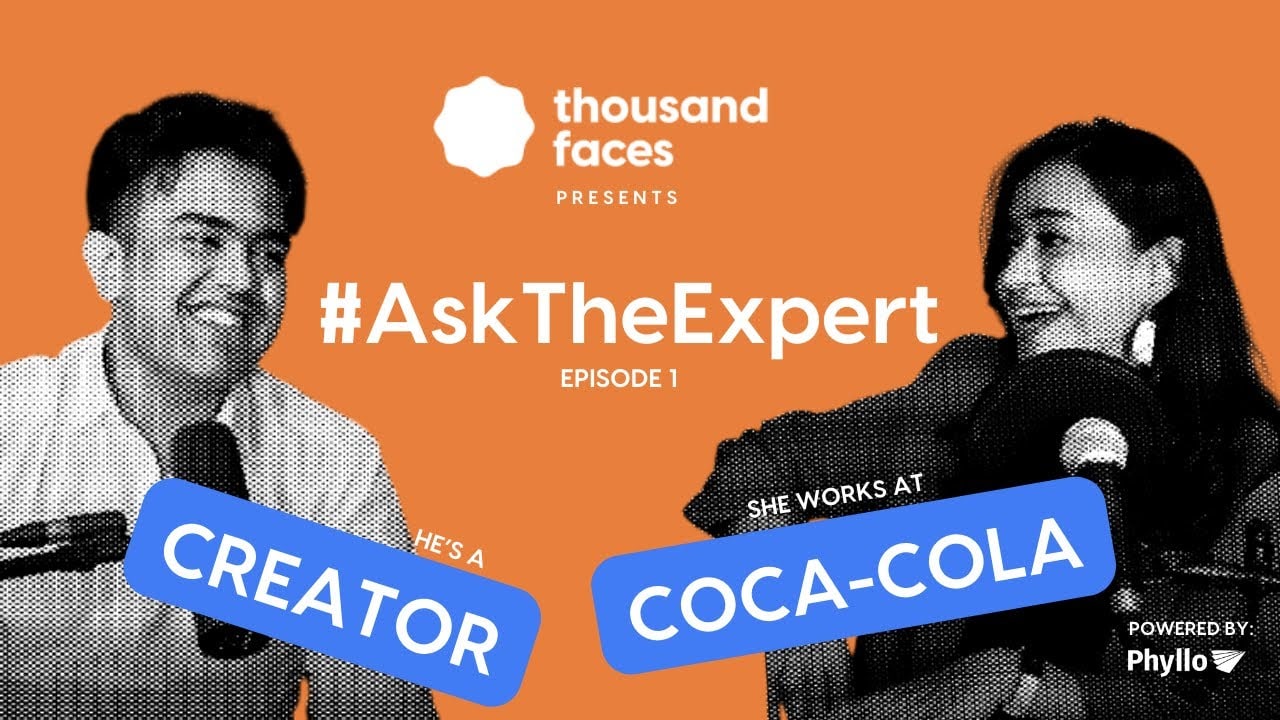
That one is from the same channel. The system is fixed: flat brand colour, halftone portraits, logo in the same place, callout badges in the same style. What changes is who is in it and what the badges say. A regular recognises the show instantly. A stranger still gets a new reason to click, because "she works at Coca-Cola" is information the last episode did not carry.
It is not perfect. The episode number is in there and the two faces are the same size, which are both things I would change. But the system is doing the work, and that is the part most channels never build.
Publishing the identical framing every week is not consistency. It reads as one video, which the audience has already decided about, repeated endlessly. Their eye learns your channel and starts filtering it out, which is the worst thing that can happen to a show that publishes regularly.
Episode numbers do not belong in the thumbnail
"Episode 47" is a filing label. It is useful to you and to nobody else.
A stranger has not heard 46. The number tells them only that they are arriving late to something with a lot of homework, which is a reason to keep scrolling.
If the number matters for your regulars, put it in the title where it costs nothing, or small in a corner of the frame. It should never be the largest text on the image.
A worked example
Take a real episode: an operations director explaining why her company stopped measuring delivery speed.
Before. Wide shot of two people at a desk, both mid-sentence, mics in frame. Text across the bottom: "Episode 47 | Supply Chain." Title: "Episode 47 with Marta Reyes."
Nothing in that stops anyone. The image has no face large enough to read, no emotion, and the only words are an index number and a category.
After. Crop tight on Marta, caught in an expression that reads as certain rather than mid-word. Text, three words, big: "Speed was wrong." Title: "Her team stopped measuring delivery speed. Revenue went up."
Same conversation. Same footage. The thumbnail now carries a face and a claim, the title carries the outcome, and the two together make one idea that neither finishes alone.
That is the whole job.
One honest caveat
A good thumbnail is necessary. It is not sufficient.
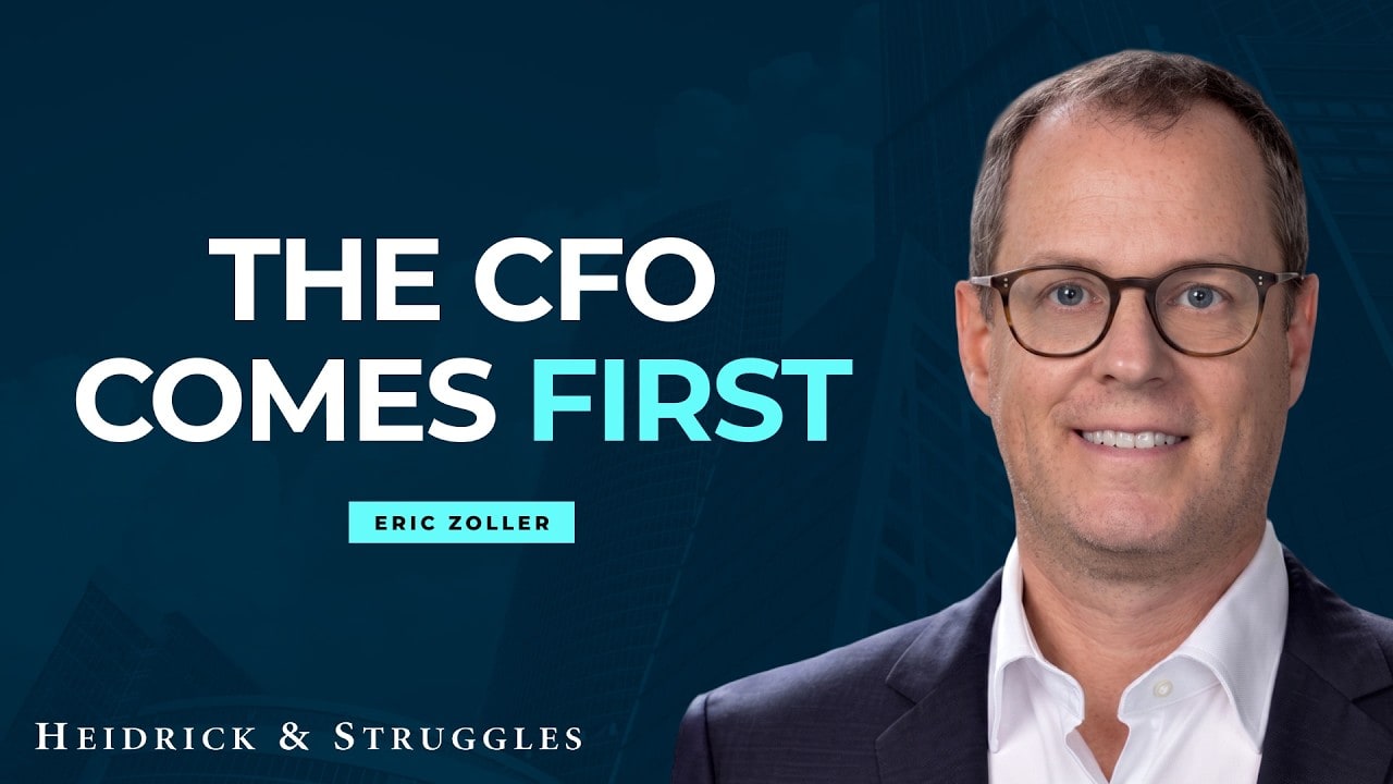
That one follows nearly every rule in this post. One face, large. Four words. Strong contrast. Guest name small and secondary. No episode number.
It has 24 views.
Packaging decides whether the people who see your video click it. It does not decide how many people see it in the first place. If a channel has no subscribers and no distribution, a great thumbnail earns a great click-through rate on almost no impressions.
Fix the packaging because it is cheap, fast and compounds. Then fix the distribution, which is slower and harder. Doing the second without the first wastes the impressions you buy. Doing the first without the second means very few people ever get the chance.
What to do this week
Repackage your five best episodes, not your five newest. Old episodes keep getting recommended for years, so a better thumbnail on a genuinely good conversation compounds quietly for a very long time. This is the highest-return afternoon available to a back catalogue.
Build one template and vary the subject inside it. A single well-made frame with defined positions for face, text and logo removes the weekly decision, which is what causes the drift back to screenshots.
Look at your channel on a phone. Not your monitor. Open your own uploads page on a phone and scroll it like a stranger. If you cannot tell your last ten episodes apart at a glance, neither can anyone else, and you have just found your highest-priority fix.
Test before publishing, not after. Ten seconds in a thumbnail tester beats a week of wondering why an episode underperformed.
The uncomfortable part
A podcast thumbnail is not decoration applied after the work is finished. It is the entire audition.
The conversation is the expensive part and you have already paid for it. The thing that decides whether anyone hears it takes an hour and usually gets fifteen minutes at the end of the day, which is why so many good shows have an audience of seventeen people.
Start with one episode. Crop in on the guest, cut the words down to four, and put it next to your last ten. You will see the problem immediately.
We produce and package B2B podcasts, thumbnails included. See what that looks like.