Mark Rober does not make thumbnails that look like viral thumbnails.
No giant number stamped in the corner. No face pulled into a screaming, veins-out expression. No three-word overlay shouting at you. And yet his videos routinely clear 20, 30, even 40 million views, in a niche (science and engineering) that most creators are told is "too slow" to go viral.
So I pulled his last 10 uploads and sat with every thumbnail, the same way I did with MrBeast. The interesting part is not that Rober is good. It is that he breaks half the rules MrBeast religiously follows and wins anyway.
The reason: he is running a different system, aimed at a different feeling.
MrBeast packs stakes and numbers into a thumbnail. Mark Rober packs curiosity and craft. Same discipline, opposite levers. This is the breakdown of how the curiosity engine actually works, frame by frame, with his real thumbnails.
The frame: Rober sells wonder, not consequence
Before the patterns, the constraint that explains all of them.
A MrBeast thumbnail answers the question "what will I get?" A pile of cash, a surviving contestant, a destroyed Lamborghini. The promise is consequence.
A Mark Rober thumbnail answers a different question: "what is that?" Your brain sees something it cannot file, and the only way to resolve the itch is to click.
That single difference cascades into every choice below. Wonder needs a clean frame, because clutter kills mystery. Wonder needs a believable human reaction, because a fake scream breaks the spell. Wonder needs production value, because a strange thing rendered badly just looks fake. Keep "curiosity, not stakes" in your head and the rest of the system stops feeling like style and starts feeling like logic.
Pattern 1. One question, one subject
Every strong Rober thumbnail is built around exactly one thing your eye cannot explain.
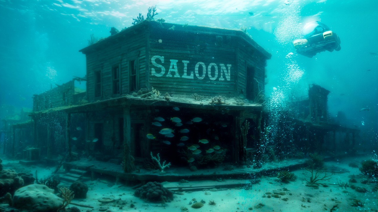
"Uncovering America's Underwater City." There is no face, no text overlay, no number. Just a wooden saloon sitting on the ocean floor with a tiny submarine for scale. Your brain cannot file it, so you click.
This is the whole engine in one image. A wild-west building, underwater, with a submarine drifting past it. The "SALOON" lettering is part of the scene, not stamped on top. There is one subject and one question: how is this real?
Compare that to the amateur instinct, which is to cram the frame with every cool moment from the video. Three subjects, a face, a logo, a text block. At the size a thumbnail actually displays on a phone feed (roughly 200 pixels wide), that reads as visual noise. Rober does the opposite. He subtracts until a single mystery remains.
How to apply it:
- Find the one image from your video that makes someone go "wait, what?" That is your thumbnail. Everything else is a distraction.
- If you cannot point at a single subject and name the curiosity gap in one sentence, your frame is too busy. Cut.
- Resist the urge to "prove" the video is packed by showing five things. One unanswered question out-clicks five answered ones.
Pattern 2. Genuine wonder, never a cartoon scream
Rober's face shows up in most of his thumbnails. It is almost never doing what a MrBeast-clone face does.
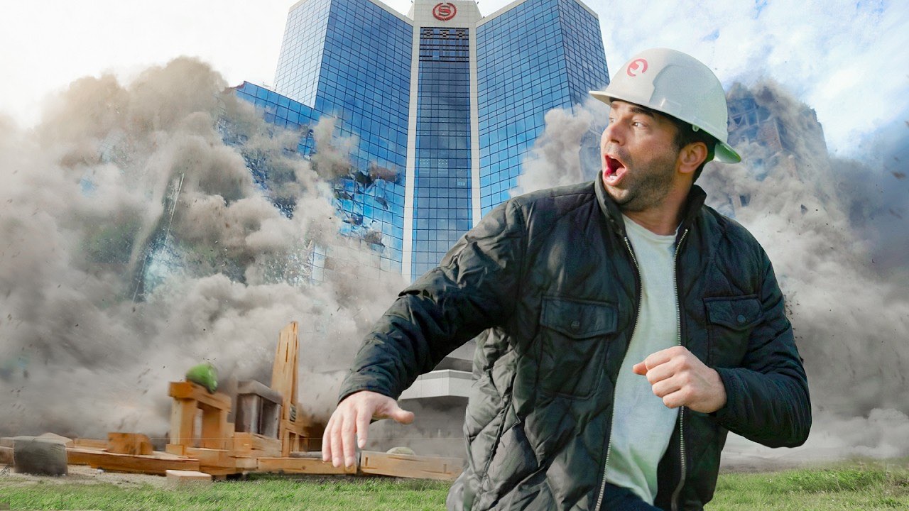
"I Blew Up A 24 Story Building." His mouth is open, but read the eyes. That is genuine awe at something real happening behind him, not a performed scream. The reaction sells the spectacle as authentic.
This is the single biggest difference between Rober's packaging and the thousands of thumbnails copying the viral formula. A screaming, eyes-bulging face reads as manufactured. Rober's expressions read as a real person reacting to a real thing: focused, delighted, genuinely surprised. That authenticity is a trust signal. It quietly promises the video will not waste your time.
He does have a louder register. His combat-RC-car thumbnail is the closest he gets to pure MrBeast energy, a big open laugh, action frozen mid-air with sparks flying.
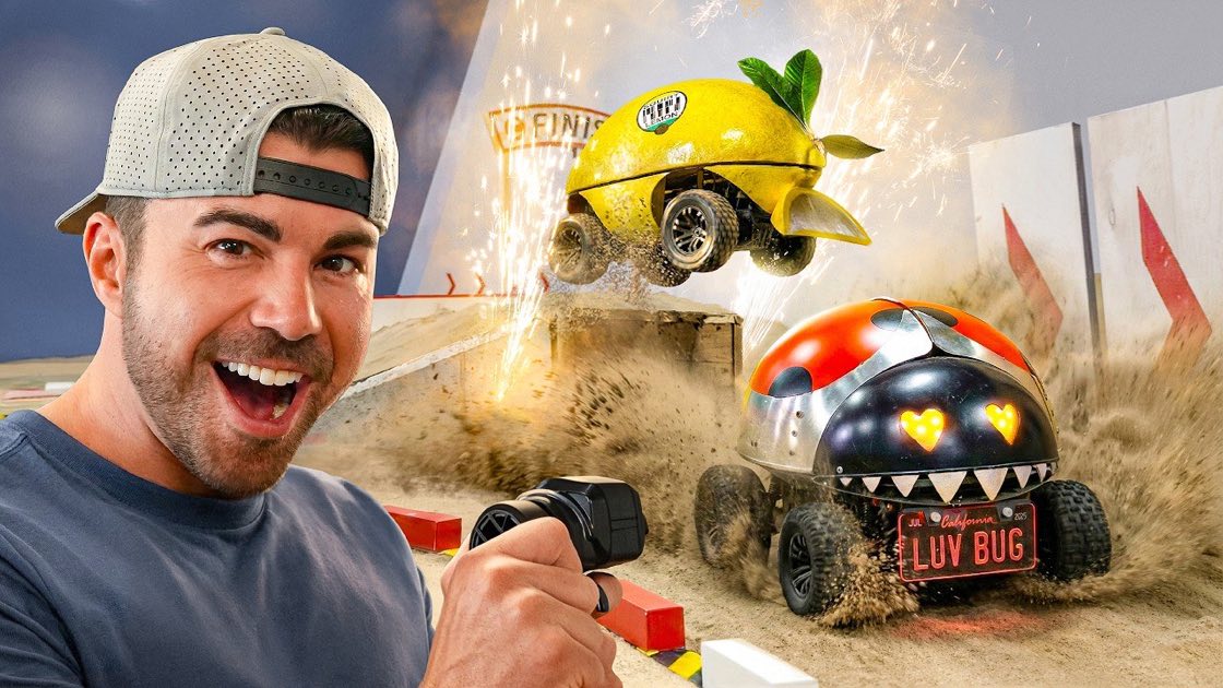
"Engineers vs Junkyard RC Car Death Match." Even his loudest expression stays on the believable side of the line. It is a real laugh at a real moment, not a face contorted for the algorithm.
How to apply it:
- Shoot your reaction to the actual thing, not to a camera. The difference is visible even at thumbnail size.
- Aim for one clear, believable emotion: wonder, focus, delight. If it looks like you are acting, dial it back.
- Your face does not need to be the biggest thing in the frame. In a Rober thumbnail it shares the stage with the spectacle, because the spectacle is the point.
Pattern 3. Warm subject, cool background
Look at Rober's most cinematic thumbnails and the same color logic repeats: a warm subject popped against a cool background.
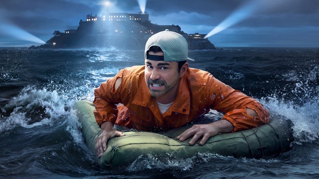
"How to Escape Alcatraz With Basic Engineering." Orange jacket, warm skin, against cold blue water and searchlight beams. The color separation makes him pop off the background instantly, even on a small screen.
It shows up again on his space video: warm orange safety vest and a fiery rocket plume against a clean blue sky.

"I Spent $5,000,000 So You Can Go To Space For FREE." Warm subject, cool sky, plus an open-hand gesture that points your eye at the rocket without needing an arrow.
This is not a coincidence or a vibe. Warm and cool are opposite ends of the color wheel, so a warm subject on a cool field creates maximum separation. The subject leaps forward, the background recedes, and the eye locks on instantly even in a crowded feed. It is the same reason lifeguards and construction crews wear orange against blue water and gray concrete.
How to apply it:
- Decide which element is the hero, then push it warm (orange, red, warm skin tones) and push the background cool (blue, teal, deep shadow).
- If your shot is all one temperature, fix it in the edit. Warm the subject, cool the background.
- This single move does more for thumbnail-size legibility than any text or arrow you could add.
Pattern 4. He deletes his own face when the world is stronger
This is the advanced move, and it is the one almost no creator has the discipline to make.
Most YouTubers treat their face as mandatory. Rober treats it as optional. When the subject of the video is strange enough to carry the click by itself, he gets out of the frame entirely.
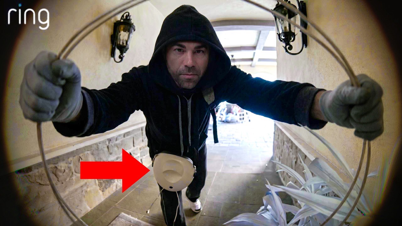
"I Outsmarted Pro Car Thieves." No Rober at all. It is a doorbell-camera point of view, so you are the target, a hooded figure reaching toward you. The tension is stronger without his friendly face in the shot.
The underwater saloon from Pattern 1 does the same thing. Two of his last 10 thumbnails have no face at all, and both are environment-led mysteries where his presence would have reduced the intrigue.
Notice the one tell: when the face disappears, he sometimes adds a single red arrow to give the eye a focal point (in the car-thieves frame, pointing at the hidden device). Without a face there is no natural anchor, so he supplies one deliberately. One arrow, one job, never decoration.
How to apply it:
- Ask honestly: is my face making this thumbnail more clickable, or am I just in it out of habit?
- If the subject is genuinely strange, try a version with no face. Put the mystery in the spotlight.
- When you remove the face, add one clean focal cue (an arrow, a light, a gesture) so the eye still knows where to land.
Pattern 5. Almost no overlaid text
Count the words stamped on a Rober thumbnail and you usually land on zero.
This breaks the most-repeated thumbnail advice on the internet, and it works because of division of labor. The title carries the words. The thumbnail carries the curiosity. When he does show text, it is almost always baked into the scene (the "SALOON" sign, a license plate) rather than an overlay shouting over the image.
Overlaid text costs you two things. It competes with the one subject you want the eye to lock onto, and it makes the frame look like an ad. Rober's clean compositions read as premium, and premium quietly signals "this video is worth your time" before a single second has played.
How to apply it:
- Write the thumbnail text last, and default to none. Make the image earn the click on its own first.
- If a word genuinely adds curiosity, keep it to one or two and try to source it from inside the scene.
- A clean frame is not a missed opportunity to add text. It is a deliberate choice that reads as quality.
Pattern 6. Cinematic production is the trust signal
Rober's best thumbnails do not look like thumbnails. They look like film posters.
The Alcatraz frame has depth, atmosphere, searchlights cutting through night fog. The underwater city has god-rays and particulate. This level of finish is itself a message: the same care went into the video. In a feed full of slapped-together images, a frame that looks like a movie poster signals a tier of quality before anyone clicks.
You do not need Rober's budget to borrow the principle. Depth, intentional lighting, and a clean focal subject are free. The "movie poster" feeling comes from craft and restraint, not money.
How to apply it:
- Build depth: a clear foreground subject, a midground, and a background that recedes. Flat thumbnails read as cheap.
- Light with intent. One strong light direction beats flat, even lighting every time.
- Finish the frame. Clean edges on cutouts, believable shadows, no harsh halos. The polish is the promise.
Bonus pattern: borrow another face for reach
Two of his last 10 rent a second audience by putting another star in the frame.
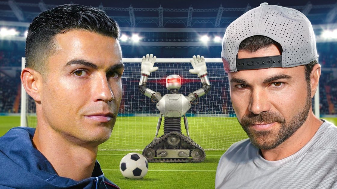
"Ronaldo vs My Unbeatable Goalie Robot." Two faces, two fanbases. This was the highest-viewed thumbnail of the ten I pulled. The robot goalie sits dead-center as the curiosity gap, with a recognizable star borrowing reach on the left.
He does the same with a MrBeast collaboration. The lesson: a collab is a packaging decision, not just a content one. A second recognizable face in the thumbnail pulls in an audience that already trusts that person. Use it when the collab is real and the second face is genuinely bigger or adjacent to yours.
The counter-example: when Rober breaks his own system
Not every Rober thumbnail is a masterclass, and the weak one is instructive.
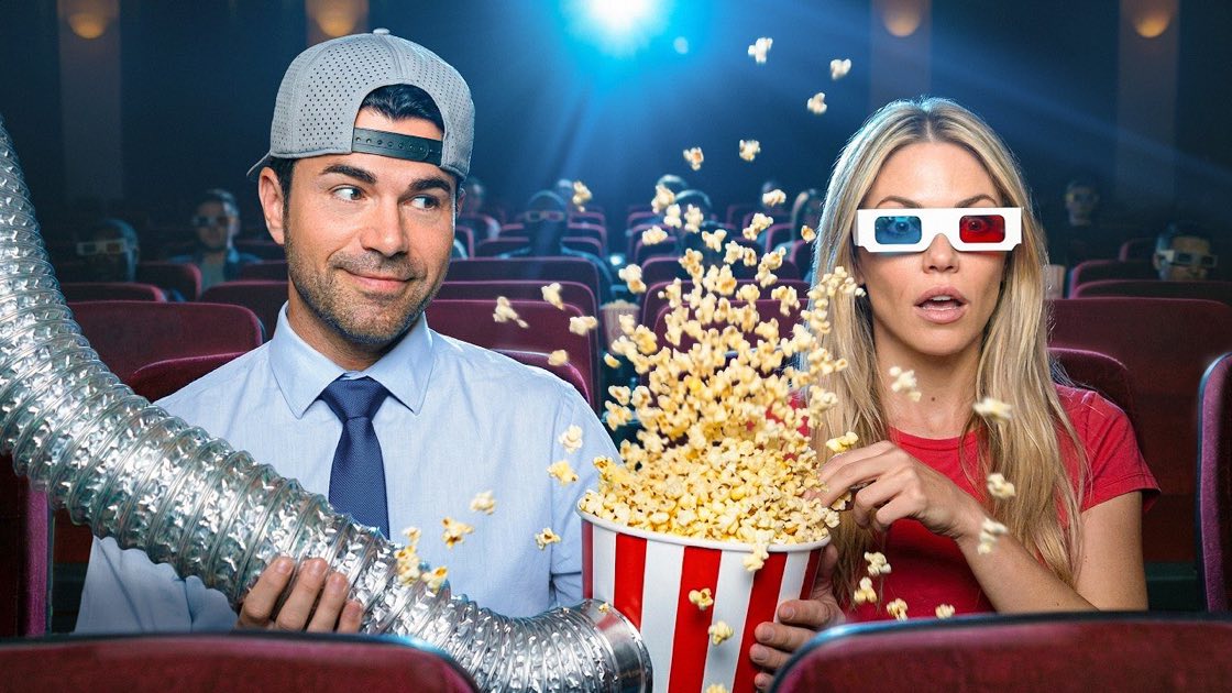
"I Engineered The Perfect First Date." Two competing subjects, flying popcorn, and a silver HVAC duct gag that is illegible at thumbnail size. The eye does not know where to land. It was also the lowest-performing thumbnail of the ten.
Everything that makes his other thumbnails work is missing here. There is no single subject (he and the woman compete for attention). There are three or four ideas fighting (the smirk, the shock, the popcorn, the duct). And the cleverest element, the HVAC gag, completely vanishes at the size people actually see it. This is what happens when you abandon "one question, one subject," even if you are Mark Rober. The system is the thing, not the person.
The system, not the style
If you read all six patterns and thought "this is just good design," that is the point.
Rober did not invent a secret. He picked a lane (curiosity over stakes) and applied the same discipline to every upload for years. One subject. One genuine reaction. Warm on cool. Minimal text. Cinematic finish. The face removed when the world is stronger. None of those are hard to understand. Doing all of them, every time, with the restraint to subtract, is what almost nobody manages.
The creators who copy MrBeast's loud formula and conclude "this does not work for my science channel" have the wrong reference. Rober is proof that a quieter, craft-led system can win just as hard, and that it suits an educational niche better. The mistake is copying the surface of whichever creator you admire. Copy the system instead, and tune the levers to the feeling your niche actually sells.
The shortcut worth knowing
The Rober system takes time. Find the single curiosity gap, shoot a believable reaction, separate the subject from the background with color, build depth and lighting, and resist adding text. Done properly, one thumbnail is hours of work.
That is the problem we built Artiphik to solve. We trained it on what is actually working in each niche, including science and engineering, so the patterns show up in the output by default: one clear subject, a genuine expression, warm-on-cool separation, clean framing without text clutter. You get a curiosity-first thumbnail in the first generation instead of after three hours of tweaking.
Try the free tier and see the system applied to your channel. No card, nothing to cancel.
Mark Rober is not a mystery. The thumbnails are the map. The curiosity is the territory.
Related: the 5 patterns in every MrBeast thumbnail and the thumbnail critique framework.