Most thumbnails ship without ever being judged.
The creator looks at the file in their downloads folder, says "yeah that looks good," and uploads. Then they wonder why the video did 600 views instead of 60,000. The thumbnail is the single biggest variable in YouTube CTR. Almost no creator runs a structured check on it before hitting publish.
This post is the structured check. A 7-point framework, the 5 most common failure modes, and a 60-second self-audit you can run on every upload before it goes live.
The 7-point critique scorecard
Every thumbnail can be scored against the same seven criteria. The top performers in any niche pass all seven. Most of what gets uploaded fails three or more.
| # | Check | What you are testing | Pass looks like | Common failure |
|---|---|---|---|---|
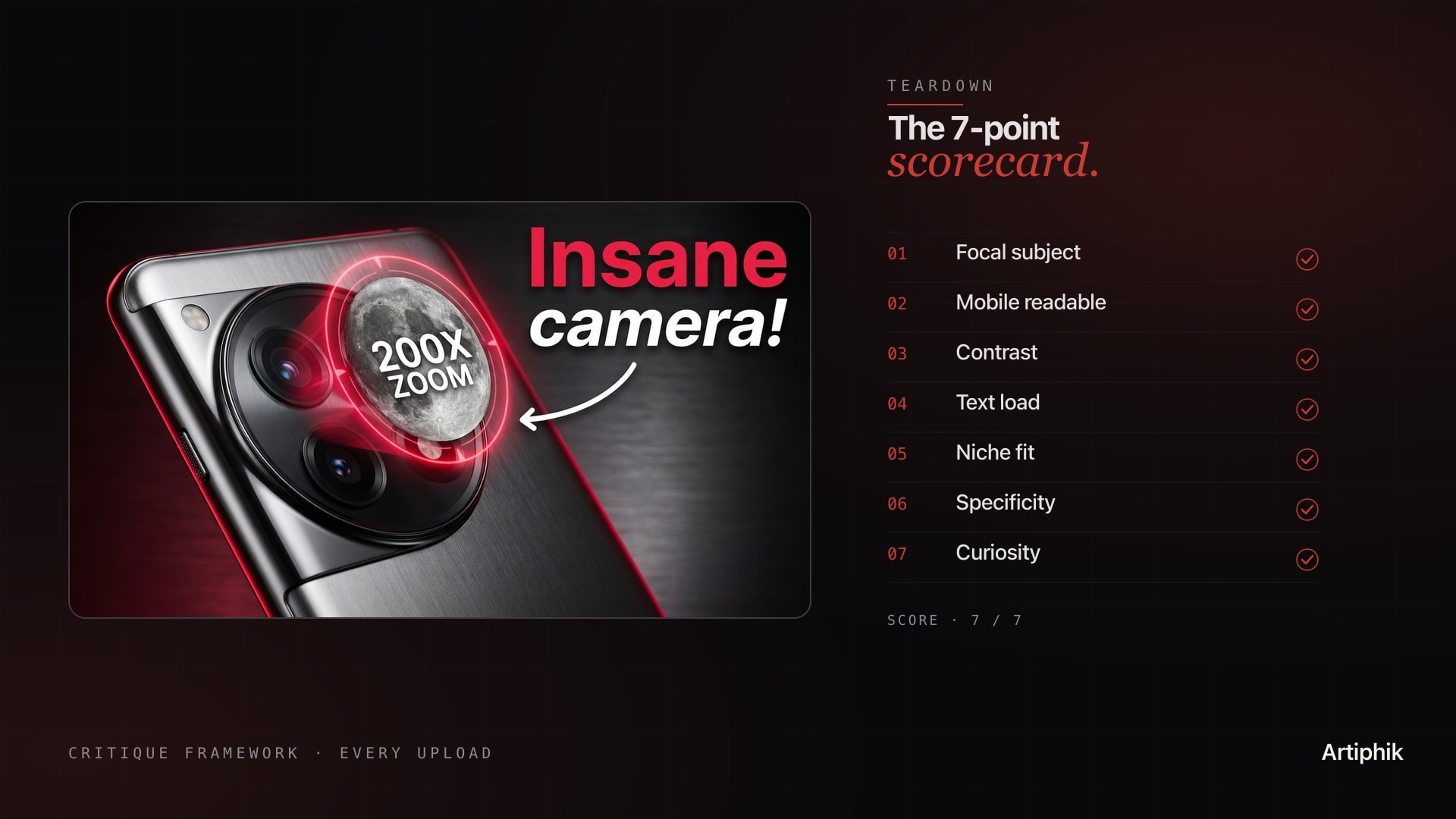
| 1 | Focal subject | Can the viewer identify the main subject in under 1 second | One clear hero element occupying 30 to 50 percent of the frame | Cluttered scene with no clear subject |
| 2 | Mobile readability | Does it work at 200-pixel width on a phone | Subject + text readable at thumbnail-feed size | Designed at 1280px, falls apart at 200px |
| 3 | Contrast | Is there a clear bright-versus-dark separation between subject and background | Hero element pops against a darker or simpler backdrop | Subject blends into background |
| 4 | Text load | Is on-thumbnail text under 4 words and legible | 1 to 4 word punchline, bold, high contrast | Sentence-long subtitle, small font |
| 5 | Niche fit | Does it visually match what is winning in your niche right now | Same patterns as top 3 niche videos last 30 days | Looks like a generic AI render |
| 6 | Specificity | Is the promise concrete | Number, name, time bound, transformation visible | Vague "tips on X" framing |
| 7 | Curiosity | Does it leave exactly one question the video answers | Clear stake plus 1 unresolved tease | Either gives everything away or shows nothing |
Score each from 0 to 1. Anything below 5 out of 7 needs revision before upload. Above 6 is shippable. A perfect 7 is the difference between a CTR of 8 percent and a CTR of 12 percent on the same content.
The 5 most common failure modes
The check list above describes what good looks like. Most creators do not fail because they cannot make a good thumbnail. They fail because they ship one that hits a known failure mode without realizing it.
Failure 1: No focal subject. The thumbnail tries to show three things at once. A face, a product, a chart, an environment. The viewer's eye does not land anywhere. CTR drops 30 to 40 percent versus a single-subject version of the same idea.
Failure 2: Mobile collapse. The thumbnail looks great on a 27-inch monitor and falls apart on a 6-inch phone screen, where 70 percent of YouTube viewing happens. Tiny text, thin lines, low-contrast colors. The single highest-volume mistake on the platform.
Failure 3: Text wall. A 7-word subtitle that reads "How I Made $10,000 in My First Month" jammed across the bottom in a small font. The viewer cannot read it in one second, so they read the title instead, and the thumbnail does no work. Cap text at 4 words. Make those 4 words huge.
Failure 4: Niche mismatch. The creator imported a thumbnail style from a different niche (gaming-style red arrows on a finance video, or finance-style stock-photo-suit on a vlog). The algorithm and audience pattern-match on niche. A mismatch reads as off, even when it is technically well-designed.
Failure 5: Hero face with flat emotion. The biggest single boost a thumbnail can get is a face with strong, readable emotion (shock, joy, fear, disbelief). The biggest single penalty is a face with neutral expression. A neutral hero face is worse than no face at all because it occupies the focal slot without doing the focal work.
If you can spot a thumbnail hitting any one of these failure modes, you can fix it in 10 minutes of editing. Most creators just do not look.
How to score against your niche
The 7-point framework gives you absolute scoring. Niche scoring gives you relative scoring. Both matter. The algorithm cares about both.
Pull the top 3 videos from the last 30 days in your niche. Not your top 3, the top 3 in your niche category that are NOT yours. Open them side by side with your draft thumbnail. Ask three questions.
Compositionally, do they look like the same kind of video. Same use of faces or no faces. Same level of text density. Same visual energy (busy versus minimal). If yours is dramatically different, the algorithm has a harder time recognizing what slot to put your video in.
Tonally, are they in the same emotional register. Are the niche winners showing high-stakes drama, calm authority, or playful curiosity. Match the register. Do not import drama into a calm-authority niche.
Promise-wise, are they offering similar specificity. If the niche winners are all "I tried X for 30 days" and yours is "tips on X," yours will lose. Specificity is contagious in a niche. Once one video proves a format works, the next 5 in that niche need to match or beat it.
You are not copying. You are matching the language the niche audience already accepts.
The 60-second self-audit
When you do not have time for a full critique, run this fast pass before every upload.
Seconds 0 to 10: Mobile shrink test. Open the thumbnail at full size, then resize the window or your phone preview until the thumbnail is 200 pixels wide. Can you identify the subject in under 1 second. If no, fix the focal point.
Seconds 10 to 25: Stranger test. Show it to one person who does not know what the video is about. Cover the title. Ask "what do you think this video is about." If their guess does not match your actual video, your thumbnail is mis-packaging.
Seconds 25 to 40: Niche pattern test. Open YouTube. Search your niche keyword. Look at the top 5 videos. Does your thumbnail visually fit alongside them, or stand out as obviously different. If it stands out the wrong way (looks like a different niche), revise.
Seconds 40 to 55: Failure-mode scan. Fast pass against the 5 failure modes above. No focal subject, mobile collapse, text wall, niche mismatch, neutral face. Hit any of them. If yes, fix.
Seconds 55 to 60: Commit or revise. If you got through 0-55 with no flags, ship. If you flagged 1 to 2 issues, fix and re-run. If you flagged 3 or more, the thumbnail is not ready, do not upload yet.
This is the difference between thumbnails that average a 4 percent CTR and thumbnails that average 8 percent. Same content. Different upload-day discipline.
When to throw it out and start over
Sometimes the right call is not to fix a thumbnail. It is to make a different one.
If the thumbnail fails 4 or more of the 7 points, the underlying concept is broken, not the execution. A bad concept rendered better is still a bad concept. The fix is to go back to the idea and ask whether the video's hook is actually thumbnail-able. If the hook does not have a single visual moment that captures it, you may have a script problem disguised as a design problem.
The strongest creators iterate on the thumbnail concept multiple times per video, not just once. They do not assume their first idea is the right one.
What to do next
The 7-point check above is what every thumbnail should pass before upload. Doing it manually takes 5 to 10 minutes per draft. Doing it on every video for a year is a habit that compounds.
If you want the same check run against your niche's actual benchmark data, Artiphik's thumbnail audit does it in 30 seconds. Drop in your draft, get a scored teardown across all seven points plus a niche-fit comparison against the top videos currently winning in your space. Free tier covers 2 audits to test, no card required.
Related reads:
- How to design YouTube thumbnails that get clicks for the design pass that comes before the critique
- YouTube CTR benchmarks by niche to know what range you should be aiming for
- The first 10 seconds: a YouTube retention playbook for what comes after the click
Most creators upload and hope. The ones who win run the check.