Most creators pick their thumbnail font the same way.
They open Canva, scroll the font list on a 27-inch monitor, and stop when something looks bold and nice at full size. Then the video goes live, the thumbnail shrinks to a 200-pixel tile in a mobile feed, and the carefully chosen font turns into an unreadable smudge. Nobody clicks. The creator blames the topic.
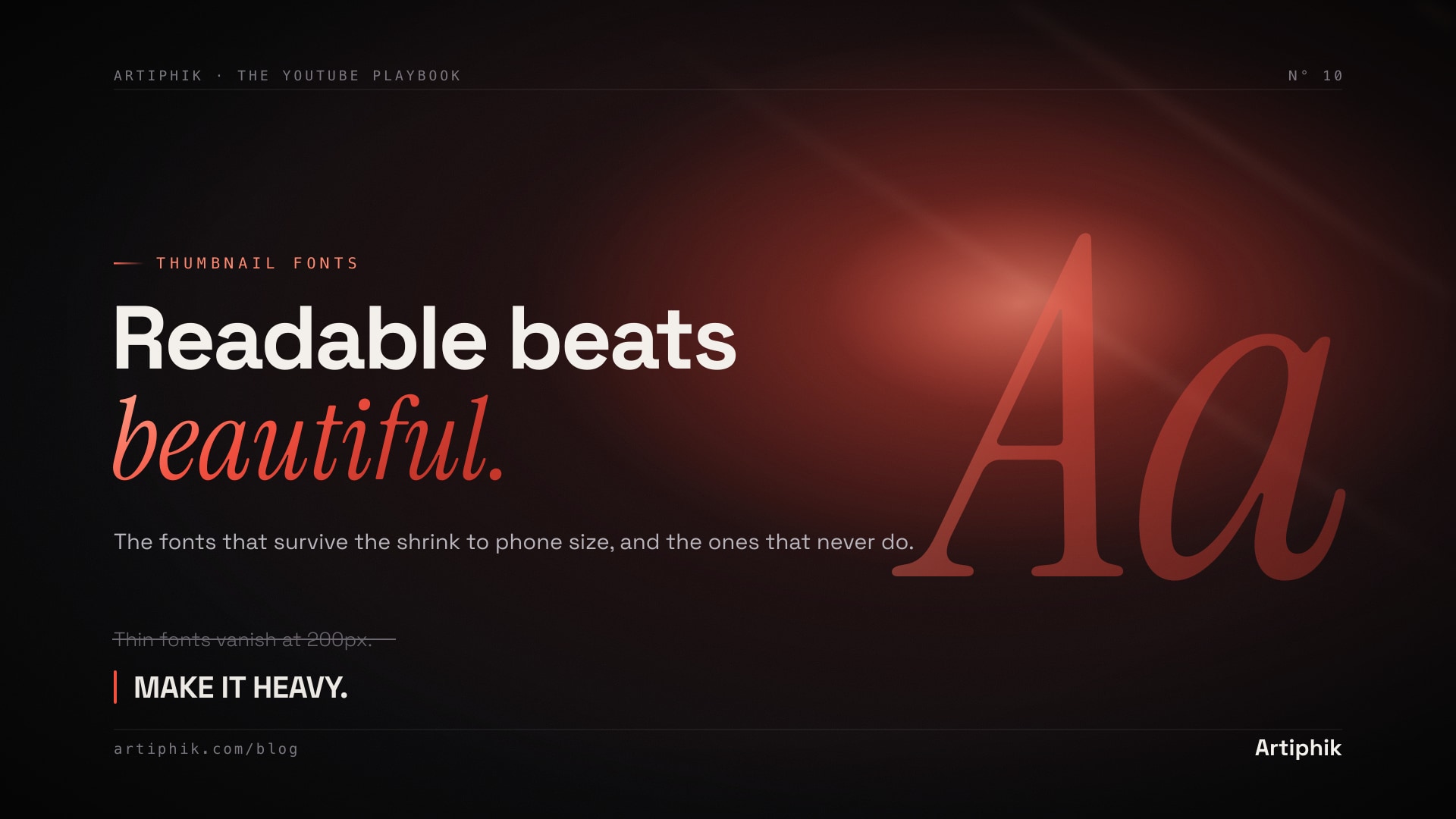
The font is not a decoration on a thumbnail. It is a legibility system that either survives the shrink to phone size or it does not. Roughly 70 percent of YouTube watch time happens on mobile, which means your thumbnail competes as a thumb-sized tile, not the 1280-pixel artboard you designed it on. This post covers the fonts that survive that shrink, the ones that never do, and why how you treat the font matters more than which font you pick.
The one job a thumbnail font has
A thumbnail font has exactly one job: be readable in under one second at 200 pixels wide, surrounded by four other thumbnails fighting for the same click.
That is a brutal constraint, and it eliminates most fonts immediately. Anything thin, anything with fine detail, anything narrow and tightly spaced, anything decorative. The fonts that pass are almost always the heaviest weight in a clean sans-serif family. Weight is the single most important property. A medium-weight version of the perfect font will lose to a heavy-weight version of a mediocre one, every time.
If you remember nothing else: pick the bold, then pick the font. Not the other way around.
What a thumbnail font actually needs
Five properties separate a font that works from one that looks fine on your monitor and dies in the feed.
| Property | Why it matters | What to look for |
|---|---|---|
| Weight | Thin strokes vanish at small size | ExtraBold, Black, or Heavy only |
| Cap height | Tall caps read faster in a tile | Large x-height and cap height |
| Counters | Closed letter shapes muddy when shrunk | Open counters in a, e, o, s |
| Spacing | Cramped letters blur together | Slightly loose tracking, not tight |
| Consistency | Mixed strokes flicker at small size | Even stroke width across letters |
You do not need to memorize type terminology. You need to run one test. Take your draft, shrink it to 200 pixels wide on your phone, and see if the main word reads in one glance. Every property above is just a reason a font passes or fails that test.
The fonts that work
These are the heavy sans-serifs that consistently survive the mobile feed. Most are free.
| Font | Best for | Where to get it |
|---|---|---|
| Montserrat ExtraBold / Black | Clean default for finance, tech, education, lifestyle | Free, Google Fonts |
| Anton | Big punchy hooks on challenge and entertainment | Free, Google Fonts |
| Bebas Neue | Tall condensed caps, fits long words large | Free, Google Fonts |
| Oswald | Condensed, news and commentary energy | Free, Google Fonts |
| Roboto Condensed Bold | Neutral workhorse, plays nice with faces | Free, Google Fonts |
| Komika Axis | Gaming, kids, high-energy challenge | Free, dafont |
| Druk / Tungsten | Premium editorial weight, magazine feel | Paid, Commercial Type |
The free five at the top of that list cover almost every niche. You do not need a paid font to compete. MrBeast-style thumbnails are recreated every day with Anton and a thick outline. The premium faces buy you a more distinct, editorial feel, but they do not out-perform a well-treated free font on raw click-through.
The fonts to never use
These are the failure modes. Each one quietly tanks legibility.
Thin and light weights. A "Montserrat Light" thumbnail looks elegant at full size and disappears at phone size. The strokes are too fine to survive the shrink. This is the single most common font mistake on the platform.
Script and handwriting fonts. Pacifico, Dancing Script, anything that mimics cursive. The connected, flowing letterforms turn into a blur the instant the thumbnail is small. They read as wedding invitations, not video hooks.
Thin serifs. Times, Georgia, Playfair. The fine strokes and brackets that make serifs elegant are exactly what vanishes at 200 pixels. A heavy slab serif can work as a deliberate vintage style for the right niche, but a standard serif loses to almost any heavy sans.
Default system fonts at default weight. Arial Regular and Helvetica Regular are not wrong, they are just not heavy enough to win the focal slot. If you use them, use the Bold or Black weight, never the regular.
Three or more fonts on one thumbnail. This is not a font choice, it is a discipline failure. Each extra font fragments attention. One font, or one plus a small secondary tag font, is the ceiling.
The treatment matters more than the font
Here is the part most font guides skip. The exact typeface is maybe 30 percent of why a thumbnail's text reads. The other 70 percent is the treatment.
Outline. A thick contrasting outline, usually dark around light text or light around dark text, separates the word from whatever is behind it. This is the trick that lets bright text sit over a busy photo. Almost every high-CTR thumbnail uses one. Without it, text fights the background and both lose.
Drop shadow. A subtle hard shadow under the outline adds a second layer of separation and a sense of the text floating above the scene. Keep it tight and dark, not soft and gray.
All caps for the punchline. Caps read faster at small size because every letter sits at the same height with no descenders to lose. Cap the 1 to 4 word hook. Leave any longer secondary line in mixed case.
Color contrast over color choice. Bright yellow, white, and red are common because they pop against the dark, busy backgrounds thumbnails tend to have. The specific color matters less than the contrast against what sits behind it. Yellow text on a bright sky is invisible. The same yellow on a dark explosion is unmissable.
Take the same word, in the same font, and the difference between no treatment and a heavy outline plus caps plus high contrast is often the difference between a 3 percent and a 7 percent click-through rate.
How to pick yours in 60 seconds
You do not need to agonize over this. Run the fast pass.
Seconds 0 to 20: Default check. Is your niche calm-authority or high-energy. Calm, reach for Montserrat ExtraBold. High-energy, reach for Anton or Komika Axis. That choice alone covers most cases.
Seconds 20 to 40: Treatment. Apply a thick contrasting outline, a tight dark shadow, all caps on the hook, and the highest-contrast color against your background. The font does 30 percent, this does 70.
Seconds 40 to 60: Shrink test. Drop the thumbnail to 200 pixels wide on your phone. If the main word reads in under one second, ship it. If not, the issue is almost always weight or contrast, not the font itself.
What to do next
Picking and treating a thumbnail font well takes a few minutes per video once you know the rules above. Doing it on every upload is what separates the channels that grow from the ones that plateau with great content and weak packaging.
If you would rather skip the font fiddling entirely, Artiphik generates your thumbnail with the text already weighted, sized, outlined, and contrasted for the mobile feed. You describe the video, it ships a thumbnail with the typography handled the way the rules here describe. Free tier to test, no card required.
Related reads:
- How to design YouTube thumbnails that get clicks for the full design framework the font sits inside
- How to critique your YouTube thumbnail where text load is one of the 7 scored points
- YouTube CTR benchmarks by niche to know what click-through range your packaging should be hitting
The font is not where you make a thumbnail beautiful. It is where you make it readable. Get the weight and the treatment right, and the readable thumbnail beats the beautiful one every time.